Pivot
Dime.Scheduler's capacity pivot grid works just like you could reasonably expect from a pivot table. By selecting a set of (layered or grouped) rows, columns and values, you can inspect the resources' capacity from a different perspective. In essence, it compares the actual schedule of the planning board to the projected resource capacity that is managed in the back office.

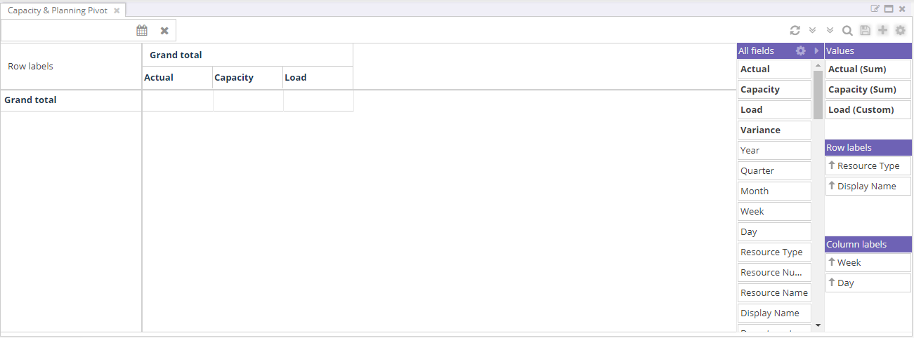
Looking at the component, three key areas can be identified:
- The configurator
- The pivot table itself
- The top bar including state management buttons
Configurator
By using the configurator on the right hand side of the pivot grid, you can drag and drop the available fields to one of the available axes. A common query would be the expression of the resources' (grouped by a common field, such as department or resource type) load over time.
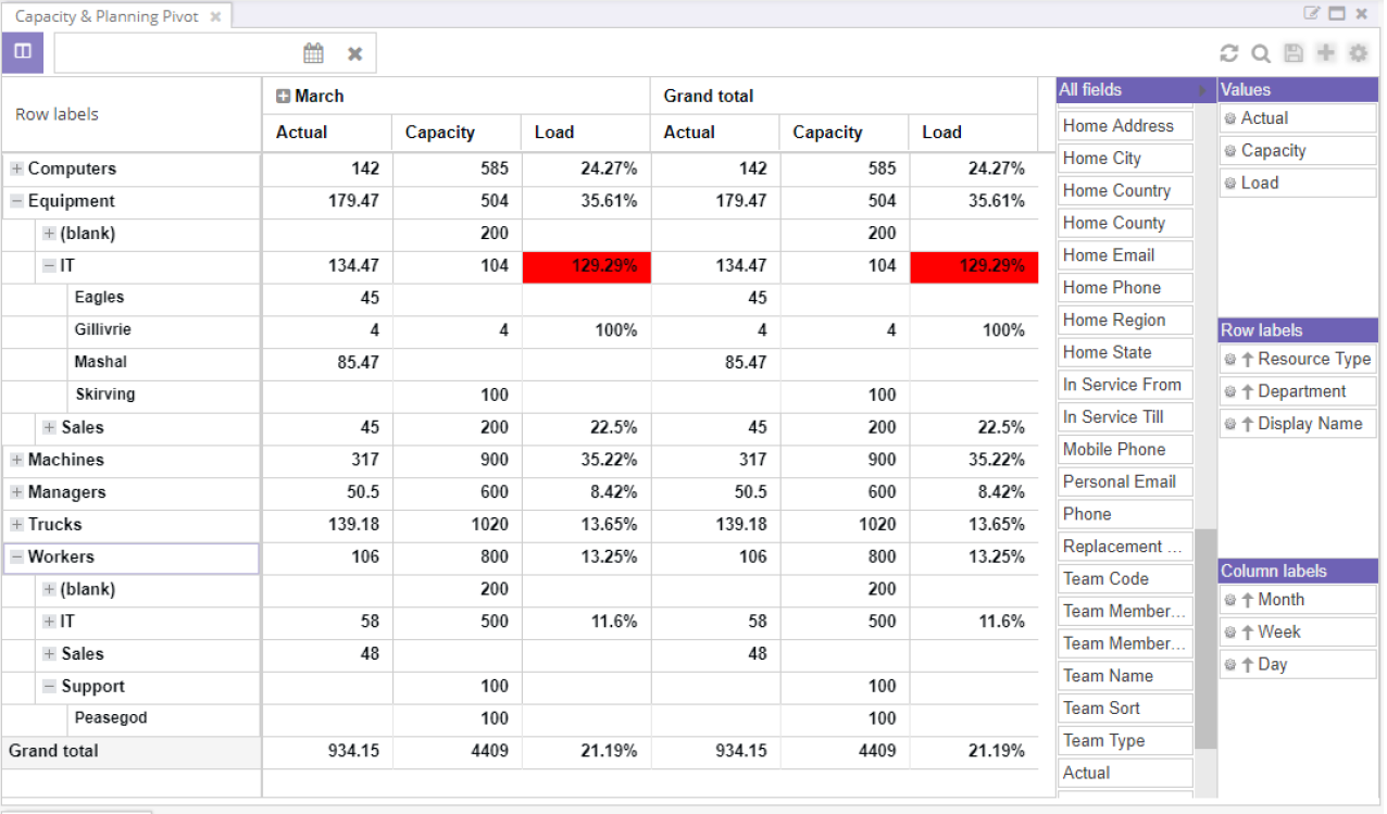
Every additional field adds a new level to the report. The example below shows a multi layered capacity report. With just one view, you can consult the daily, weekly and quarterly capacity for resources, departments and resource types.

The configurator is particularly powerful in that it allows you to drag and drop fields to any dimension. On the left hand side is a column with all fields. Three field categories can be distinguished:
- Resource fields like department, type, team, etc.
- Date fields like day, week, month, etc.
- Value fields like planned quantity, capacity, load and variance
Even though these categories have no actual meaning other than to inform the user, it is likely you will create reports across these three categories.
Select labels
Row labels
The row labels are displayed on the vertical axis of the pivot. The first item will be on the top level which will group all the subsequent row labels. Same goes for the second level, which will group all labels beyond itself, etc.
As an example, this configuration...

... will create the following result:

Column labels
The same applies for the column labels, which will be displayed on the X-axis of the pivot. For example, this...

... will create the following result:
Values
The values column are the intersection of the column and row labels and will display the aggregates. For example, this following configuration...

... will result in:

Sorting and filtering labels
There are extra capabilities that grant you the possibility to create powerful and reports. Row labels and column labels can be sorted and filtered. By clicking on the cog wheel of a field in the configurator, the following context menu will be displayed:

Label filters are those that filter on the data in the axis. For instance you could create a report for a certain resource type during a given time for a given time span. The pivot grid subsequently will filter out all records that do not match the query.
Value filters are slightly different because they query the capacity values directly rather than the underlying resources. For example, value filters let you search for resources with a load that exceeds 100%. The pivot grid will execute this filter on the lowest level (capacity per resource per day), which will have its implications on the aggregated level.
Reordering labels and values
In addition to sorting and filtering, labels and values can be reordered. This can be done in two ways.
Via drag and drop
Via the label's or value's menu in the configurator:
Totals
The cog wheel icon next in the header of the configurator reveals additional settings.
A pivot grid would not be complete without having the possibility to see sub totals and grand totals. Dime.Scheduler allows you to configure the position of these total fields:
- Row subtotal position
- Row total position
- Column subtotal position
- Column total position
Axis layout
In addition, users can choose between three layout options to display the row labels. Specifically, one can choose between a outline and compact layout. The former displays each label as a column where the latter displays the labels as a tree which can be collapsed and expanded. In contrast to the tabular layout, sorting is only possible for the first row label.
Top bar
Also see the state section for information on the majority of the buttons on the top bar of this component. In addition to these buttons, there are two buttons that enable the user to collapse or expand all columns and rows in the pivot grid.
Also, the pivot grid has its own date picker. It has the same look and feel as the date picker component and the date picker in the planned tasks component, and much like the latter, it is scoped down to this component alone. If there is a value set in this calendar, the integration with the date picker component (to which the pivot grid is connected) will be ignored altogether.
Finally, two arrow buttons enable the user to collapse and expand the rows and columns with one click.
The pivot grid
The pivot grid is similar to the other grids in terms of look and feel although it is slightly different. Partly because the configuration is done in a separate section and partly because of the multi-dimensional approach of a pivot table. Filtering, sorting and grouping is done via the configurator although the user is able to sort in the pivot grid as well (this sorting however is not stored in the state).

Any row and column can be expanded by navigating the levels via the [+] and [-] icons. Every group aggregates the data from the underlying data. If the capacity exceeds 100%, the "Load" and "Variance" aggregators will be marked in red to show a potentially problematic situation for some of the resources. By double clicking on a cell in the pivot grid, the drill down table is opened. All entries inside this group can be consulted, allowing the planner to identify which resources' capacity are exceeding 100%:

Aggregators
There are four aggregators in the pivot grid:
- Actual
- Load
- Capacity
- Variance
The first two aggregators are based on transactional data whereas the other two are calculations of the former aggregators. The actual aggregator reports on the planning quantity of the resource's appointments. The planning quantity can be expressed in hours but it can be any unit. Every modification to an appointment will determine a planning quantity, it does so by dividing the duration of the appointment in seconds by a conversion unit. The default conversion unit is hours and so the duration of the appointment in seconds is divided by 3600, so the planning quantity for an hour-long appointment will be one as well. However, the pivot grid's lowest unit of time is a day, which implies that the planning quantity of a resources is grouped by day. If a resource has five appointments which, for the sake of simplicity, all last one hour, the actual capacity of the resource is five hours.
The second aggregator, the load aggregator, is a theoretical number which is a prediction of the capacity of a resource. For some industries and resource types, this is easier to predict than others. For example, the capacity of a lorry is ten tonnes whereas the capacity of a consultant is a variable thing. It is important that the capacity is expressed in the same unit as the appointment's planning quantity, or you'll end up comparing apples to oranges. The back office system is responsible of providing the data in Dime.Scheduler. As soon as this is done, the pivot is ready to be used properly.
The third and fourth aggregators are closely related because they compare the actual capacity to the theoretical capacity. It expresses whether resources are overbooked or idle. At a glance, planners can spot bottlenecks and act accordingly. The capacity aggregator divides the actual value by the load whereas the variance aggregator subtracts the actual value from the load. If the capacity is less than 100% and the variance is positive, the resource might be available for carrying out an extra task. If the variance is negative and the capacity is more than 100%, the resource is overbooked and may not execute all of its tasks for that given day.
Multi-day capacity distribution modes
The selected multi-day capacity distribution mode in the application setup controls the way how the capacity of multi-day appointments is determined. The planning quantity forms the basis of the capacity reporting but it does not factor in the distribution of capacity in time. Some industries prefer a constant level (for example, renting out heavy machinery) while others are in favor of a evenly distributed capacity model (for instance the stock of certain supplies).
There are three multi-day capacity distribution modes available:
- None: all the capacity is reported on the first day of the multi-day appointment
- Constant: the capacity is the same for each day of the multi-day appointment
- Even: the planning quantity is divided by the length (in days) of the appointment
Let's illustrate these modes with a simple example. Suppose a customer of a rental company has rented a piece of equipment for 3 days. The customer will pick up the equipment at the warehouse at 9 AM and will return it two days later at 3 PM. That works out at a capacity of 54 hours.
You'll find in the table below that the capacity distribution mode has a big impact on the capacity reporting:
| Capacity distribution mode | Day 1 | Day 2 | Day 3 |
|---|---|---|---|
| None | 56 | 0 | 0 |
| Constant | 56 | 56 | 56 |
| Even | 18 | 18 | 18 |
In the rental business, the constant multi-day capacity distribution makes most sense because there is no such thing as a partially rented piece of equipment. Even if an appropriate conversion function was used (an hour is not the most logical unit of measure for this particular industry), the other two multi-day capacity distribution modes would display a distorted vision of reality which could result in duplicate bookings made the planner who was unaware that the equipment was unavailable.
Connected components
The pivot grid is connected to two other components in the profile:
- Date picker
- Resource filters
When a pivot grid is added to the profile, it will not automatically load data. The user needs to hit the refresh button in the top bar to load the data. If there is a date picker or planning board on the profile, the active date ranges will be applied on the pivot grid as well. Changing the dates on these components will also modify the range on the pivot grid. However, the pivot grid also has its own date picker to overrule this default behavior.
Also, just like the connection between the resources grid of the planning board and the resource filters component, there is a connection with the pivot grid. This allows you to query the capacity of resources that match a certain query or requirement.
State
By now you noticed that the pivot grid has the same look and feel as the other components. You can add as many pivot grids as you want to the user profile, and each one can have its own state. This means you can save layouts and share them with other users. This effectively converts your ad hoc reports into report templates.
The following elements are stored in the template:
- Rows and columns
- Sorting and filtering
- Aggregates
- Totals configuration
- Row labels layout type
- Collapsed or expanded state of the configurator
In contrast to the other components, the local sorters inside the matrix are not stored. To avoid confusion, it needs to be stated that the sorters and filters inside the configurator are collected.