Look & Feel
This section will guide you through the general look and feel of the application. It should give you a good understanding of the structure and how the general concepts work together.
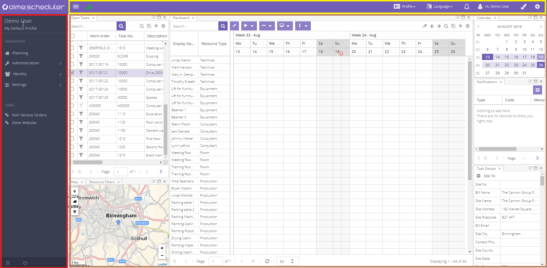
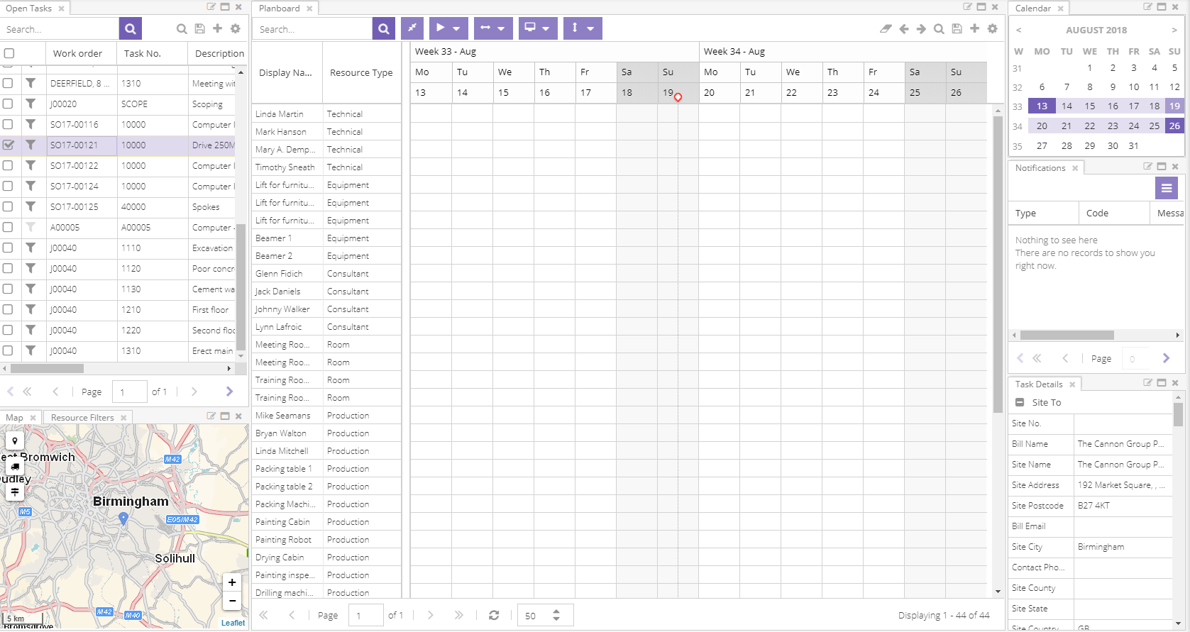
The focal point of Dime.Scheduler is depicted in the following image:

This view can be deconstructed in three parts:
- Side and top navigation menu
- Application window
- Profile area
Navigation
Main menu
The side navigation menu is there to guide the user through the various modules of the application. The sidebar also displays the name of the current user and the active user profile. It is important to know that the navigation menu is also secured: what the users actually will get to see may vary, depending on their user roles.
The menu has the following items:
- Planning: takes you to the application view with your planning board(s). This is the default view that is shown when Dime.Scheduler is launched.
- Administration: contains references to user management.
- Application setup with general settings and configuration
- Settings: has submenu items to manage master data such as resources, field templates, pane layouts and calendars.
- Monitoring contains items to monitor the application.
- Agenda has submenu items to show the planning in a read-only mode
- Developer: provides documentation of the application programming interface.
The side navigation menu can be collapsed and expanded by toggling the menu button. Furthermore, when hovering over a menu item in a collapsed menu, the submenu items will pop out automatically.
At the very bottom of the side navigation menu, there are two shortcuts which allow to toggle Dime.Scheduler in full screen mode and to log off from the application.
Links
Just below the side navigation menu, there is a section preserved for links which can be managed by the application manager in the corresponding setup view.
Application window
This area is what it's all about. This is the canvas where the planners will work their magic.

This is the heart of Dime.Scheduler. It contains all the components and actions for optimal scheduling: planning boards, open tasks, planned tasks, filtering, map, etc. All the details about working in the planning view are explained further on in this manual.
The profile area
A key concept that will be covered in great depth is a user profile. In summary, a user profile captures information about the planning canvas (for example, which components are loaded on the canvas, their height and width, which layout is set as the default, etc.) and makes it reusable across sessions and users.
The profile is managed primarily via the top bar's profile menu item:
Their purpose and how they work are covered in the subsequent sections.
Profile
This is the place to manage the profiles. Users can create and update profiles, load profiles on the fly and change the default profile. It is also possible to add new components to the canvas or existing planning boards that the user is allowed to use.
Language
The administrator determines which languages can be used but it is ultimately up to the user to choose a language 2. On a slightly technical note, users actually select their locale rather than a language. Locales add culture awareness, which is a much broader concept.
For example, date and number formatting are different in the United States than in the United Kingdom, even though they roughly speak the same language. To incorporate those differences, Dime.Scheduler supports locales by using culture codes in the language setup. In the example of the USA and UK, their corresponding culture codes would be EN-US and EN-GB. If you ever wonder why the first day of week is Sunday and not Monday, then you'll probably be using the wrong locale and should contact your administrator to rectify this.
Event notifications
Here you will receive general system notifications. If you have new notifications the icon will show the number of notifications.
Account
Allows you to log off.
Styling
This section is dedicated to the theme and color configuration, and are stored as part of the user profile.
The selected theme or color will immediately be applied, but just like the other settings in the profile, they will not be saved automatically. Users need to store the profile explicitly in order to persist the changes.
Profile settings
The cogwheel icon reveals and conceals a series of buttons and switches to configure the profile. What these settings are and what they do will be explained in greater detail further in the user manual.
This slide-in pane is divided into three sections:
- General settings like time zone
- Scheduler settings like start date and date span
- Map settings such as the unit of distance and route profile
Status icons
On the left-hand side of the top bar, there is space for four icons: .
Connection
The connection icon indicates the connectivity status between the browser and server. If the icon is rendered in orange or red , it means there's an issue with the connection. This means that real-time updates may not be received during this session. This doesn't necessarily mean that the server is down; it's just that updates of tasks and appointment may not be automatically updated. Refreshing the components usually does still work. If it doesn't, there's a bigger issue at hand.
The browser and server will automatically attempt to re-establish the connection. When this does not work, a page refresh usually solves the problem.
Zoom level
Some features such as drag and drop and rendering of resources and appointments on the planning board rely heavily on coordinates. Users may encounter downgraded performance or downright incorrect behavior when the zoom level of the browser is not set to 100%. The device pixel ratio is a close proximity to the zoom level of the browser and/or the scale settings of the user's computer monitor, it tells us how many of the screen's actual pixels should be used to draw a single CSS pixel. When the ratio is not 1, the will be shown in the top bar. This does however not change any behavior; it just informs the user of this fact.
Default profile
Most of the features regarding state are only accessible when there's an active (or default) profile. Usually, when you launch Dime.Scheduler for the very first time, you'll probably end up with the standard profile that Dime Software provides. You won't be able to store layouts until you save a profile. To remind you of this, the is shown in the top bar. The moment you save a profile (and are working within the profile's context), the icon will disappear and the state features will be enabled.
Service monitoring
In the static configuration section, you are able to define which services to monitor. At regular intervals, Dime.Scheduler will check if the services are still running. If one of the monitored services is down, a red warning icon will be displayed. When it's back on, the icon will be hidden.
Query string parameters
To alter the behavior of the application, query string parameters prove to be a useful feature. The following parameters are currently supported:
| Name | Type | Comment |
|---|---|---|
skipProfile | Boolean | Set to true to skip loading the default profile |
waitForResourceFilters | Boolean | Set to true if the planning board should wait for the default resource filters to be initialized |
profile | String | Choose the name of the profile to be loaded instead of the default - or standard, if there is no default - profile. |
Here is an example of the query string in action: http://www.dimescheduler.com/?waitForResourceFilters=false&profile=My%20Profile. The application will attempt to load a profile named 'My Profile' and will not wait for the default resource filter to be loaded to fetch the resources and appointments in the planning board.
Read more
- The administrator can assign a language and time zone when a new user is being created. Note that this is not a mandatory step. However, the application will always prompt the user to select a language and time zone.↩