Introduction to components
A part of what makes Dime.Scheduler so flexible is its capability to allow you - the user - to create your own workspace using the provided building blocks, or what is better known as components. Each component has its own set of distinct features that may or may not be relevant for your planning activities. Most of these components are also stateful, meaning that you can store its settings and share it with other users. The statefulness of these components are also referred to as layouts.
You can have as many components (and subsequent layouts) as you want in your workspace and you can arrange them in any way you want to. Dime.Scheduler allows you to store these workspaces, also known as profiles. And just as with the layouts, profiles can be shared with other users.
The available components are the following:
- Open Tasks: shows tasks that need to be planned.
- Planned Tasks: shows planned tasks in a grid for easier searching.
- Task Details: shows detailed information about a selected task (open or planned) or appointment.
- Gantt Chart: allows to plan projects using a Gantt chart including dependencies, constraints and multiple planning modes.
- Map: shows the map, location of addresses, position of resources and assets, calculated route, travel time and travel distance.
- Resource Filters: allows to filter resources on the planning boards.
- Calendar: you use the calendar to select a custom date range (other than the presets you find on the planning board) for the planning boards.
- Category: shows a legend of the categories, which color means what?
- Notifications: shows notifications about a selected task or appointment.
- Route Sequence: visualize and change the sequence of a selected route on the map.
- Capacity: pivot grid to report on the capacity of the resources.
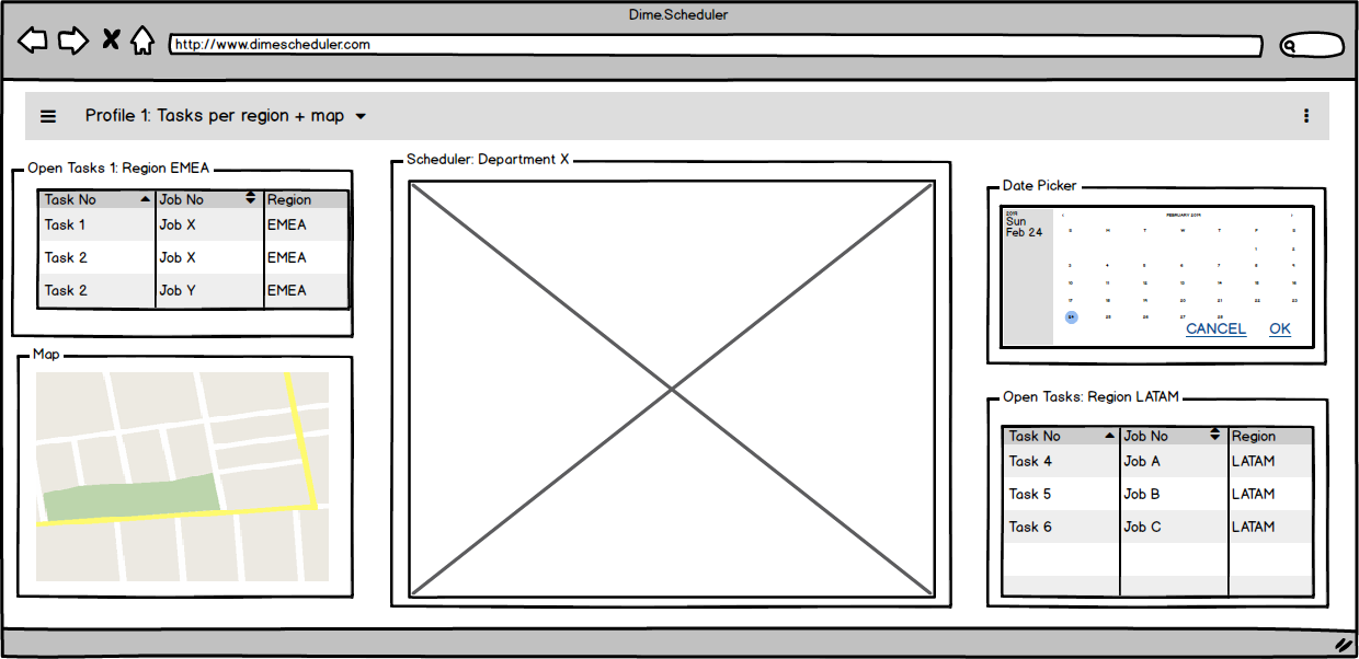
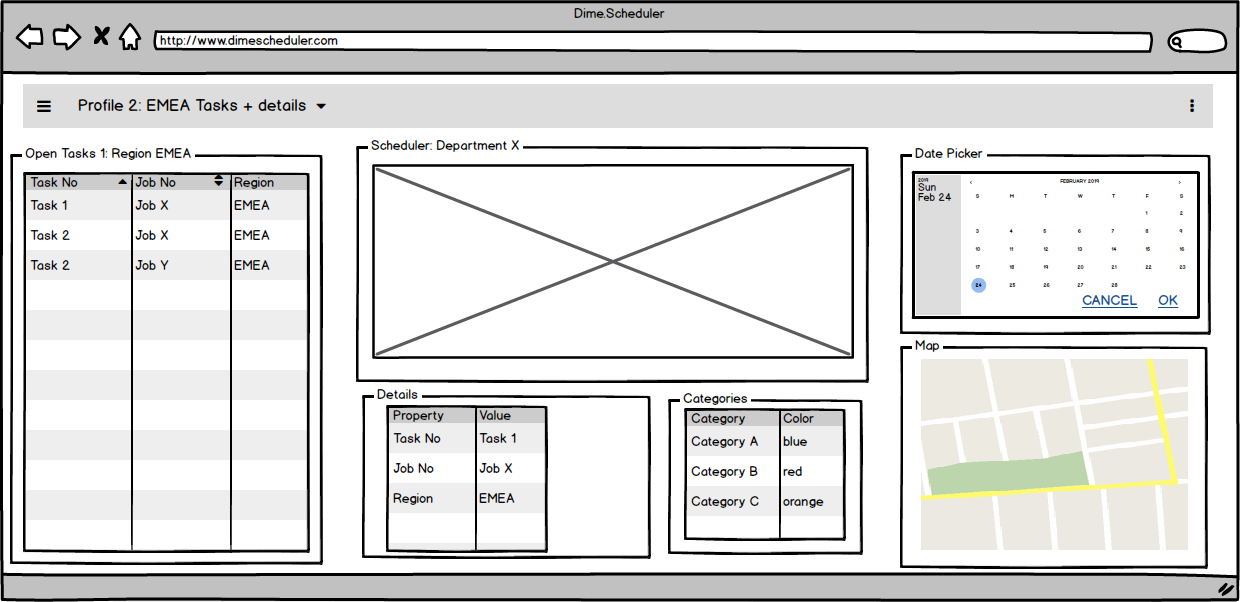
Each component has a standard setup which Dime.Scheduler applies in the absence of a default layout for that specific component in the profile. A component can be considered as a placeholder for a specific set of features which can be configured and stored. In this example below there are two open task grids with their own state. Even though they share the same type - they will provide roughly the same type of information and have the same capabilities - they will vary slightly given the customizable parameters on that component. These configurable elements will be elaborated in the next sections.

This kind of granularity (profiles, layouts and components) enables you to create a workspace according to your personal preferences. One such example is that layouts are reusable: you can use the same layout for a component in another profile, like this example:

Many of these components are connected in order to support and facilitate the planning process. One of the most important examples is the drag and drop feature that allows you drag open tasks and drop them on the planning board. All of these inter-component interactions will be covered later in this manual. All you need to know is that they exist and that the component type (disregarding any kind of layout that is applied to it) will determine their capabilities.
Quick start
📄️ Open Tasks
The open tasks component shows the list of tasks sent by the back office application that you can plan
📄️ Planning board
The planning board component is at the heart of the application.
📄️ Date Picker
The date picker allows you to select any date range, which is used in other components for filtering data sets
📄️ Resource Filters
Resource filters allow you to find the right resource for a task. You can also use them to view a smaller group of resources on the planning board. Resource filters are created from the back office application and can therefore be any kind of data. Typical resource filters are skills, regions, departments or qualifications, but of course they can be tailored to your business.
📄️ Notifications
The notifications component displays information of the selected task or appointment. It can also be used to display general notifications.
📄️ Planned Tasks
The planned tasks component shows the list of all planned tasks or appointments in the shape of a grid rather than a planning board, which allows for easier querying on the appointments. With appointments rendered in a grid - with its corresponding tools - you can easily search for appointments and analyze the planning. For instance, the planning could be grouped by customer and filtered by a team or department, crafting the data in such a shape that it is easy to analyze. Besides data querying it is also possible to perform batch or bulk updates and filter the planning board based on the selected planned tasks.
📄️ Gantt Chart
A Gantt chart is a popular tool for scheduling projects. It does this by plotting a timeline of a project's tasks.
📄️ Details
The details component, in essence, is a list of keys and values that describe the object in its scope. When an open or planned task or appointment is selected, the details component is updated automatically and shows more information of the selected record.
📄️ Pivot
Dime.Scheduler's capacity pivot grid works just like you could reasonably expect from a pivot table. By selecting a set of (layered or grouped) rows, columns and values, you can inspect the resources' capacity from a different perspective. In essence, it compares the actual schedule of the planning board to the projected resource capacity that is managed in the back office.
📄️ Map
The map provides useful insights in the planning process. Displaying resources and tasks on a map rather than a grid introduces a new planning approach and can be quite powerful.
📄️ Route Sequence
The route sequence was specifically designed to facilitate map-based planning. The component can be considered as an extension to the map rather than a standalone feature.
📄️ Indicators
Historically, this component was limited to displaying the categories. But now the scope is much wider as it not only displays the three indicators in an accordion panel, it also allows planners to quickly change the category or time marker by dragging an item from this component and dropping it on an appointment in the planning board.